One and Three Chairs, 1965, is a work by Joseph Kosuth. An example of conceptual art, the piece consists of a chair, a photograph of this chair, and an enlarged dictionary definition of the word "chair". The photograph depicts the chair as it is actually installed in the room, and thus the work changes each time it is installed in a new venue.
Two elements of the work remain constant: a copy of a dictionary definition of the word "chair" and a diagram with instructions for installation. Both bear Kosuth's signature. Under the instructions, the installer is to choose a chair, place it before a wall, and take a photograph of the chair. This photo is to be enlarged to the size of the actual chair and placed on the wall to the left of the chair. Finally, a blow-up of the copy of the dictionary definition is to be hung to the right of the chair, its upper edge aligned with that of the photograph.
Jenny Holzer
From Art 21: Whether questioning consumerist impulses, coldly describing torture, or lamenting death and disease, Jenny Holzer’s use of language provokes a critical response in the viewer. While her subversive work often blends in among advertisements in public space, its arresting content violates expectations. Holzer’s texts have appeared on posters, as electronic L.E.D. signs, and as projections of xenon light.
"Inflammatory Essays," detail. 1979–82. Offset poster.
"Often, I’ll use the first person in my work. I will assume that voice. Or I will represent many people in the first person. There are lots of I’s and You’s in the ‘Inflammatory Essays’, but they’re not me. They’re many different voices on a host of unmentionable subjects. I’m present in the choice of the subjects addressed in the work, in the form that they take, and the places they go."
"I’m afraid to talk about values these days. Usually, any time values are invoked, it’s to dismiss or maybe incarcerate somebody! I do make work that focuses on unnecessary cruelty, in the hope that people will recoil. I would like there to be less fear and cruelty."
- Jenny Holzer
For years the Guerrilla Girls have been stirring up audiences with our presentations and workshops in full jungle drag. We have appeared at schools, museums and organizations of all types, in almost every state in the U.S. and on almost every continent. For a complete list, see “Lectures/ performances/ workshops” on our chronology page.
The performance lasts about an hour and a half, followed by a question period. We take the audience through how we came up with some of our many, many posters, books (Confessions of the Guerrilla Girls and The Guerrilla Girls Bedside Companion to the History of Western Art) and actions about discrimination in art, film, politics, etc.
Guerilla Girls
In our performances for 2008-9, we will also be performing skits with the audience and sharing excerpts from our book Bitches, Bimbos and Ballbreakers: The Guerrilla Girls Illustrated Guide to Female Stereotypes. We will also speak about how we invaded the Oscars with our latest billboard and sticker campaign on discrimination in Hollywood. And we'll tell all about our 17-foot posters in the 2005 Venice Biennale, Istanbul, Athens and Mexico City.
We also conduct one-day workshops where we help students produce their own activist projects on issues that are important to them.
Friday, September 18, 2009
Tuesday, September 15, 2009
what I ended up with
The plan now is to make a kind-of stained glass type thing by cutting holes out of the printed image and placing colored textures/ceran wrap/gels behind it, on the window so that the color becomes the focus. I am still really unhappy with the final product, but I am out of time, and am still hoping to save it with the second half of the idea.

Also, I have to upload through a second website to get the colors to work on this one. O well, it's free and not that big of a deal so I will continue doing just that.
peace out, 'till tomorrow,
Robin

Also, I have to upload through a second website to get the colors to work on this one. O well, it's free and not that big of a deal so I will continue doing just that.
peace out, 'till tomorrow,
Robin
Monday, September 14, 2009
stuff from class on monday
- adobe tutorials through the university:
http://www.udel.edu/learn/usered/webtutorials.html
- copy and pasting can change color profiles in images
- adobe bridge: allows you to set your creative suite color profile
-synchronizing with your printer = consistent printing
- working RGB, or Adobe RGB are generic and will give you better results with different printers
- window>view>color profile
- illustrator gives an option to change how you view the blacks
- preferences>appearance of black>display all blacks accurately and output all blacks accurately
- duo tones: for a richer greyscale image, imagemode>duotone, change monotone to duotone, add a middle grey for second color
- when printing in illustrator, you can tile your image so that you can print a larger images on multiple pieces of paper
- image>adjust>curves: can lighten the images for ex.photos taken inside, etc. ajusts all the channels at once, better than brightness/contrast.
- select>select color
- right top of layer palette, layer options, you can change the layers to show more closely what's on them
- you should always title layers so others helping/working with you can navigate your document
-auto select makes it so you dont have to highlight a layer to move something,
or to find something do a free transform, it will be the only thing that will move
- layer>new adjustment layer: will effect anything below the adjustment layer, but makes it possible to remove the effect later in the work
- painting black on that layer will block that portion of the layer from the effect
- SAVE YOUR DOCUMENT.... it's going to crash
- "Garage Band, YEAH!... no."
- right clicking on a transform tool will take you from one transform too to another
end >.~
Sunday, September 13, 2009

Monday, September 7, 2009


Tuesday, September 1, 2009
ho humm

more doodleing
this is just a quick photoshop job, it's now going into illustrator to get cleaned up even further :)
Monday, August 31, 2009
spending hours in illustrator
simply because i can. I got a scanner for my birthday so I am trying to convert some of my better sketches into Digital files so they can be tweaked, edited, and submitted to my favorite tee shirt site :P
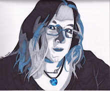
Here is one of the designs I have spent a few good hours on, but know is not finished. The whole idea is that the face is all one line. The color came later.
 Also, once again, it's WTF blue, but it looks ok to me, so no worries, but i will keep working in red :)
Here is one of the designs I have spent a few good hours on, but know is not finished. The whole idea is that the face is all one line. The color came later.
 Also, once again, it's WTF blue, but it looks ok to me, so no worries, but i will keep working in red :)
Subscribe to:
Posts (Atom)